
This following article is courtesy of Overlooked2Overbooked.com, the leading expert on all things photo for short-term rental and Airbnb listings.
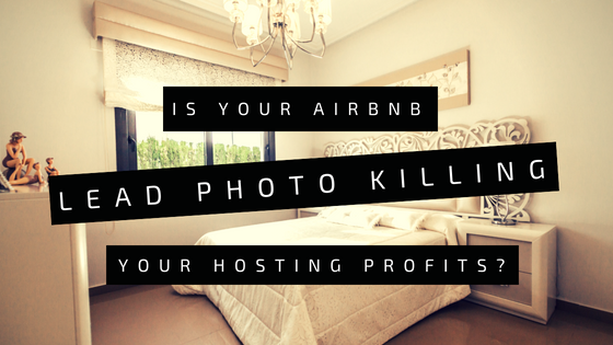
Have you had a chance to see our Top 5 Vacation Rental Photo Mistakes? The errors described in that book are being committed A LOT. Avoiding them is a critical first step. Scroll to the bottom to take a look. Once you’re avoiding all those mistakes, it’s time to take it up a notch. The next crucial skill to master is: THE KEY PHOTO.
Photos are your first impression. Potential guests see your photo before your description, your amenities, or anything else. Your key photo is the first impression OF your first impression.
I’m never going to see your other 24 photos if the FIRST ONE doesn’t grab me. This is about grabbing eyeballs and getting clicks. Your key photo needs to make the viewer desperate to see more.
How? Follow these tips to get your lead Airbnb photo right.
1. Always use landscape mode (wide, not tall) for the lead photo
[su_custom_gallery source=”media: 34743,34744,34742,34745″ link=”lightbox” width=”350″ height=”350″ title=”never”]
That means always make sure your key photo is wider than it is tall – “landscape mode”, not “portrait mode”. This little mistake can kill what would otherwise be an excellent photo. All listing sites (and nearly all websites, period) are set up to favor pictures that are wider than they are tall.
When you use a portrait mode photo, things get weird (as you can see from the photos above). A tall key photo wastes valuable thumbnail space. Or the listing site crops it and the viewer sees a blurry cut-out. On AirBnB, the key photos serves as a banner at the top and those turn really ugly real quick in portrait mode. That ain’t gonna drive traffic.
Always make sure your photos have a minimum resolution of 1024 x 683px (although we recommend you go higher!) and to keep the width to height ratio at 1.5 at all times.
2. Focus on clarity for the lead photo
There is beauty in clarity. “Clarity” may sound vague but it’s actually simple: make sure your image is clear and easy to see. This means, bright and well balanced, not too busy, and high resolution. Key photos begin as small thumbnails so “clarity” is really important for attracting clicks.
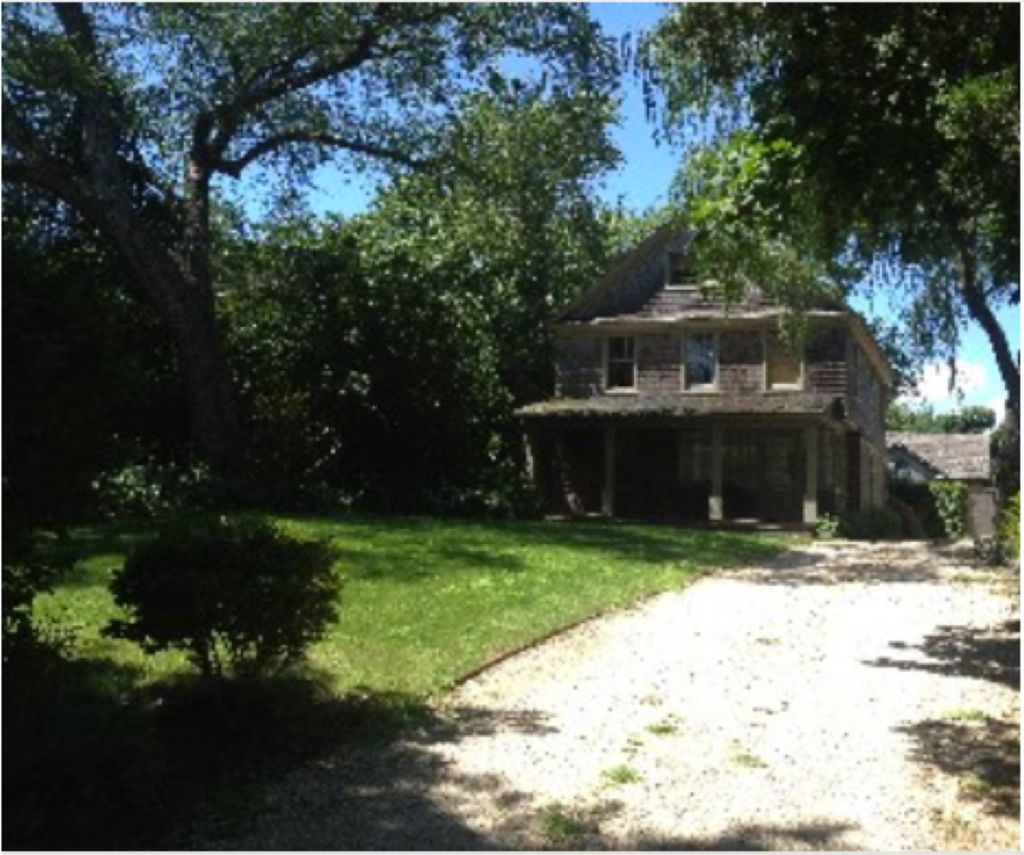
The above photo barely shows you the property. You want to see more, see it better, have the actual rental appear brighter. But that’s about the size people see when scrolling through listings.
1) Bright: the opposite of dark. Well-lit, easy to see rooms and outdoor areas simply are more attractive than dark ones. If you have an outdoor picture with a bright sky but dark grounds, bushes, and trees, there’s a simple fix: reveal the grounds in editing by “lifting” shadows and add just a pinch of saturation (never hurts!).
2) Well balanced and not too busy: clean up! The photo shouldn’t look cluttered or we can’t see the forest for the trees. But at the same time try to make sure a photo of a room isn’t all floor or ceiling (often happens with wide angle lenses); they make the image dull.
3) High resolution: your image shouldn’t be blurry and pixelated. There’s no excuse. It just implies you don’t try that hard – how could you not notice the poor quality of the key photo? Make an effort! It’s worth it.
3. Color and contrast tips for the lead photo
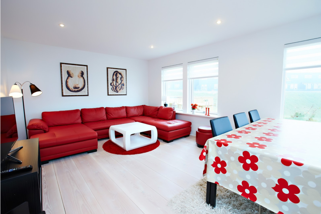
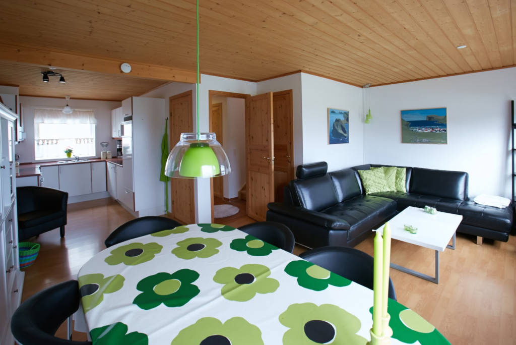
Your key photo should have something to draw the eye. If the living room is mostly white, add a dash of color, like in the above 2 photos. Too many rooms are monotone and don’t give the eye anything to grab onto. The viewer will scroll right past your listing. Blue skies and green leaves tend to look a little bland straight out of the camera (nothing compares to the human eye) so edit your photo and add a little saturation before posting it.
4. The lead photo is your best foot forward
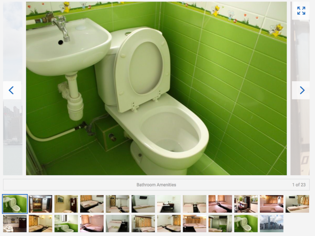
Not all photos work as a great key photo. Your key photo should impress the viewer. Did this host really want their first impression to be of their toilet? Probably not.
A good exterior shot of the house is often excellent. A nice living room can be terrific. A plain bed almost never is. A pool is often a winner. Bathrooms almost never are. If you get a chance, run your set of photos past 10-20 friends. Ask them which one they think is the most eye-catching. There’s a good chance you’ll get a near consensus.
5. Zig when your competition zags with their lead photos
Do a search of your listing that shows you vs. your competition. When your key photo is one of 6 or 9 other key photos, does it stand out? Or blend in?
When Kati did some research and went through key photos she discovered that towns tend to have trends. If everyone nearby has a log cabin, your key photo could show the snow-capped mountain view out the living room window. If everyone has greyscale living room photos, grab a view with a blue sky or throw in orange pillows and a rug.
Check out the galleries of real vacation rental listing key photos and see what you think! Who stands out? Which photo would you click? Not every town has a key photo “trend” but you never know until you do a little research. A lot of the below photos are really good, as were the rentals themselves, but this is not to pick them technically apart but to give you ideas for how to stand out from your competition and get viewers to click and book with you, not them.
Bali, Indonesia
[su_carousel source=”media: 34750,34766,34765,34764,34763,34762,34761,34760,34759,34758,34757,34756,34755,34754,34753,34752,34751,34777,34776,34775,34774,34773,34772,34771,34770,34769,34768,34767″ width=”600″ height=”100″ items=”4″]
Oslo, Norway
[su_carousel source=”media: 34800,34799,34798,34797,34796,34795,34794,34793,34792,34791,34790,34789,34788,34787,34786,34785,34784,34783,34782,34781,34780,34779,34801,34778″ items=”4″]
Perth, Australia
[su_carousel source=”media: 34802,34816,34815,34814,34813,34812,34811,34810,34809,34808,34807,34806,34805,34804,34803″ items=”4″]
Mykonos, Greece
[su_carousel source=”media: 34817,34836,34835,34834,34833,34832,34831,34830,34829,34828,34827,34826,34825,34824,34823,34822,34821,34820,34819,34818″ items=”4″]
A Closing Note:
The number 1 mistake I noticed in the multi-thumbnail listings was that nearly all hosts used very similar photos for all 3 spaces. All inside or all outside, very similar colors. I’m not getting any new information out of the three photos. Again, many listings were still very, very nice. Just not memorable.
This following article is courtesy of Overlooked2Overbooked.com, the leading expert on all things photo for short-term rental and Airbnb listings.